ONSO / IDENTITY SYSTEM / V1
Turns out, the world does revolve around you.
One ring. One traveller. One centre — and the centre is always the person holding the phone. Every service, every pro, every minute of an ETA is drawn as something in orbit around that fixed point. The mark is not a decoration bolted onto the product; it is the measuring instrument the product is built from.
The idea
the service comes to youONSO is built on one radical inversion: you do not go to the service; the service comes to you.
For most of modern life, people have adapted themselves to systems — opening hours, queues, travel, availability, appointments, locations. ONSO reverses that relationship. The user becomes the fixed point. Everything else — professionals, businesses, availability, ETA, distance, price and progress — moves around them. That is why the mark is circular. It is not a decorative circle. It is an orbit, a clock, a radar, a dial, a field of availability and ultimately a promise: the world really can revolve around you.
Rule
The centre either holds the user's own value (grade, score, minutes left) or stays empty. Never a brand element, never an ad.
Not a marketplace, not ONSO, not a provider. The centre is deliberately left open for the person using the product — or for a value that belongs to them: their ETA, rating, score, status or destination. Nothing else is allowed in. The centre is sacred.
The radius around you, the available marketplace, time remaining, progress toward completion, a score, a service area, a complete lifecycle. One geometry becomes coverage, ETA, rating, budget, loyalty and business health — without inventing a new visual language each time.
A pro coming toward you, an order advancing, an ETA decreasing, a search finding its match, a process approaching completion. You are never the moving object. The system moves. The service moves. The world moves. You remain at the centre.
Inherited from the rotary dial: you make one simple gesture, then the mechanism takes over and completes the connection. Ask once, then watch the system work for you. Reverse motion is reserved for true reversals — cancellation, refund.
ONSO is not just displaying providers around you — the platform is actively scanning the marketplace, evaluating availability, quality, distance, price, fit and timing. The mark becomes the search state itself: a live radar during matching.
When the moving dot leaves the orbit and reaches the centre, the promise is fulfilled: something in the world moved so that you did not have to. Arrival is the emotional climax of the identity — the central brand ritual.
YOU are the fixed point.
YOUR NEED creates the orbit.
ONSO activates the network.
THE WORLD moves toward you.
ARRIVAL completes the circle.
Lineage — the rotary dial
historical proof of a much larger ideaThe rotary telephone dial is part of the mark's lineage — but it is not the entire inspiration story. Its deeper relevance is not nostalgia. It was a physical interface in which identity, intention, destination and connection were all encoded as positions around one circle. A finger moved around the ring, and a remote person was brought into connection.
ONSO modernizes the same gesture: intent becomes angle, the network responds, and a real-world service is brought to you. The dial is the historical proof of the larger idea this brand is built on — one person at the centre, and the world arranged around them.
Lineage
The rotary dial was the last mass-market interface read by angle, not by position on a grid. ONSO revives that reading: angle is the data, the ring is the scale, the centre is the caller.
On the dial each digit owned a fixed angle around the ring. On ONSO each value does — 5 stars, 100 points, a full ETA are all written as positions on the same circle. Learn the dial once, read everything.
The dial only did its job when the finger hit the stop. Our traveller has one fixed destination too: the centre. An ETA is complete only when the dot lands in the middle — the service has reached you.
The dial's spring return ran clockwise and the user never touched it — motion toward completion was the machine's job. Same rule here: clockwise sweeps are the system working for you; we never run the traveller backwards except to signal a reversal.
The dial's centre disc carried the number's owner — the one fixed identity on the whole instrument. Our centre carries the user: their grade, their minutes left, or the rose YOU beacon. Nothing else is allowed in.
The customer. You are the centre of everything.
Ten stops around the ring — the many services and professionals in our network.
The first on-demand connection — human, direct and intentional.
The moment of arrival. The final click that turns intention into real-world action.
The dial moves forward. Service is progress. We move for you.
Every booking creates impact that ripples through life, business and communities.
Construction & clear space
one geometry, every sizeStroke = 7% of the diameter, never below 1.5px. Under 20px the ping and ticks drop away and only ring + dot survive.
Dot diameter = 13% of the diameter, seated on the ring's centreline so half of it overhangs outward.
A full radius of emptiness on every side. The mark is an instrument; crowding it reads as noise.
Optional scale marks at unit boundaries, 1px, 40% opacity. Present on grades and scores, absent on the identity lockup.
Mark, then ONSO at 0.32em tracking, then the descriptor ONSITE ORDER one third of the size. Stacked or inline, never rotated.
16px in list rows, 9px for the SP level point. Below that the ring becomes a solid dot and stops being the logo.
Colour
volt is the instrument, domains are the contentThe mark is volt whenever it speaks for the platform. The moment it stands for a specific service domain — a map pin, a category tile, a service row — it inherits that domain's colour, and only the colour changes. Geometry, weight and behaviour stay identical, which is what keeps fourteen colours reading as one system.
The ring doubles as the pro's live status when it wraps an avatar on the map.
The mark in 3D
from wireframe to volt — the modelling processThe ONSO mark was not drawn flat and extruded — it was modelled. The ring is a torus with a single open gap at the upper-left; the dot is a sphere held at its exact centre, never touching the orbit. The design process below documents that build in black and white: topology first, then clay, then light, then material. Colour is withheld until the geometry earns it — volt arrives only in the final pass.
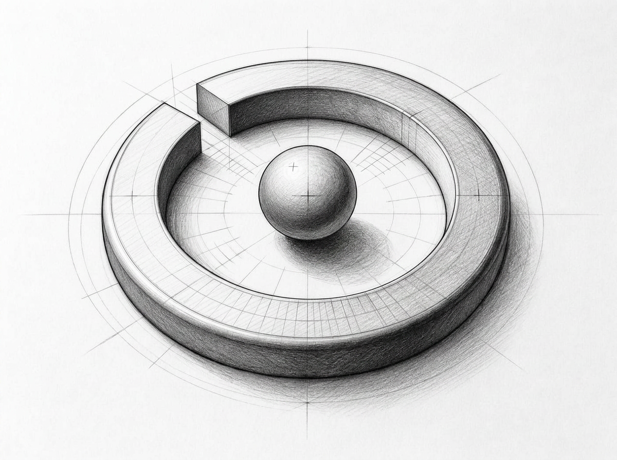 Stage 00 — Pencil study
Before the model, a drawing — and then the drawing in motion. The pencil study resolves the open torus and the floating centre sphere by eye; the motion study below is the same geometry turning in space, the ring orbiting around the fixed YOU dot. Stage 00 is both the still sketch and the turntable pass.
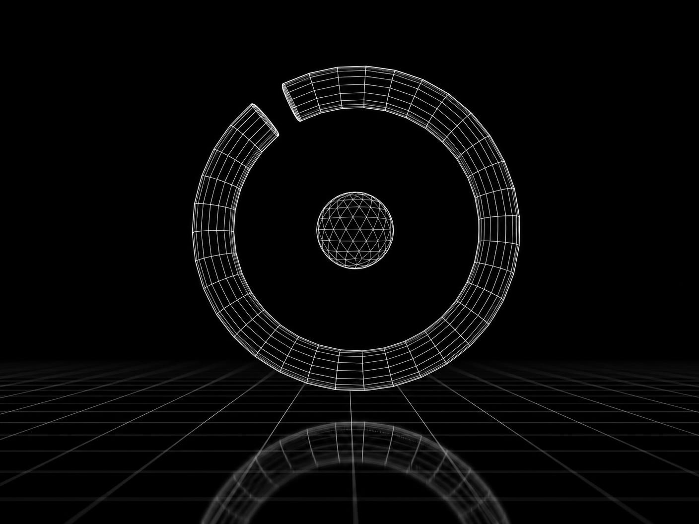 Stage 01 — Topology
Pure wireframe. Two bodies only: one open torus, one centre sphere. The gap position and the sphere's exact concentricity are locked here, before any surface exists.
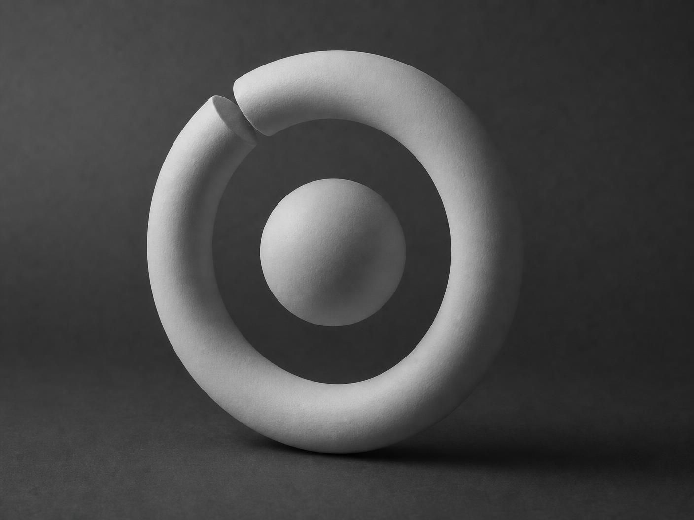 Stage 02 — Clay
Matte grey clay strips away colour and reflection so proportion is judged on silhouette alone — tube weight against sphere diameter, gap width against overall radius.
 Stage 03 — Light study
Gloss black under a single rim light. The ring must read as one continuous gesture; the highlight sweeping the curve is how we verify no facet breaks the orbit.
 Stage 04 — Material
Brushed anodized metal and polished obsidian. Chamfered gap ends catch a hairline highlight — the physical proof of the open ring that defines the mark.
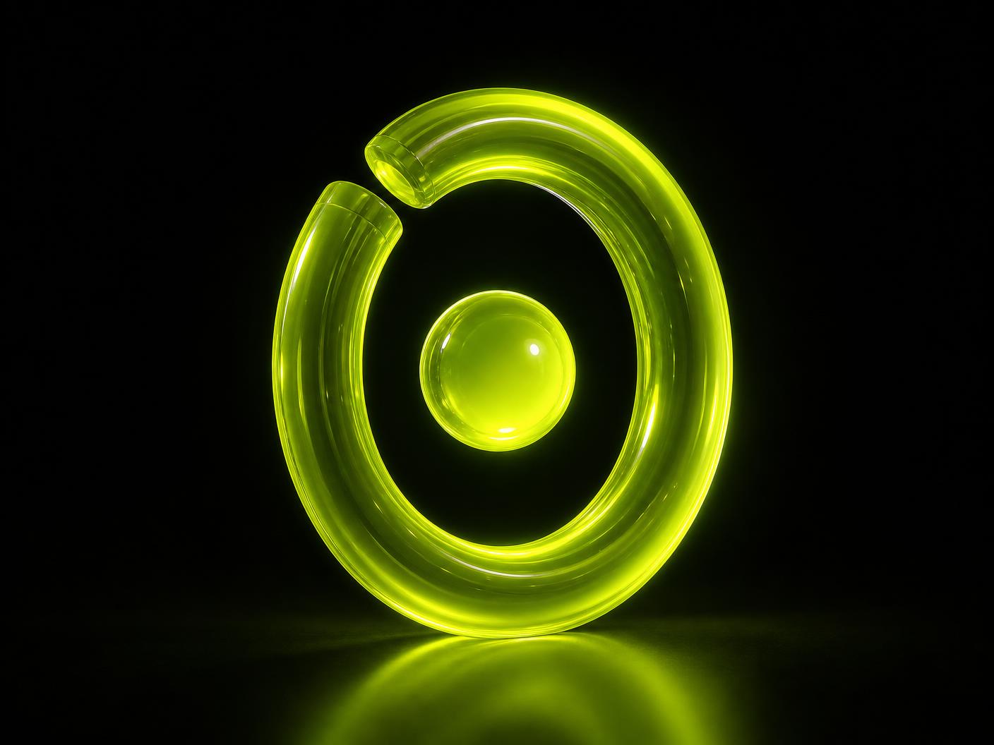 Final — Volt
Colour is the last decision, not the first. When the geometry survives every monochrome test, the mark earns volt: a glowing glass ring in the platform's prime colour, the sphere lit from within at the centre — the YOU dot, floating exactly where it always sits. One model, rendered at every angle the product will ever need.
Search radar
scanning for the best pro, around youWhen you search ONSO for the best service provider, the interface does not show a spinner or a results skeleton — it shows the mark doing its job. The ring becomes a live radar: a volt sweep rotates around your fixed position at the centre while provider blips light up as the beam passes over them. The moment the ranking engine settles, a second ring locks onto the best match and holds it.
Meaning
Search is drawn as a scan around the user, never a list the user must dig through — the instrument goes out and brings the best pro to you.
One 3.2s clockwise revolution — clockwise is progress. Blips flash only as the beam crosses them, so the animation reads as detection, not decoration.
The best match earns the full mark — ring around its blip, volt glow, BEST MATCH callout. One lock per scan; if two providers tie, the ring alternates between them, it never splits.
The rose core at the centre is the same YOU beacon from the map. Range rings and crosshair stay at 10–20% opacity so the geometry assists the scan without competing with it.
The radar resolves the instant a result exists — it never loops past the moment of truth. A scan that finds nothing contracts inward and reports "no pros in range" instead of pretending to search forever.
The mark at work
every instrument in the product is the logoOn the tracking screen the orbit becomes a countdown: the traveller starts at twelve o'clock when the pro accepts and sweeps clockwise as the minutes burn down. Arrival is the only moment the dot leaves the ring and settles in the centre — the service has reached you.
One sweep = the full original ETA · centre lands only on arrival
Stars were replaced entirely. To rate a pro you drag the traveller clockwise around the ring; the grade you are giving sits in the centre in your own hand's position. Rating becomes a physical gesture around your own point of view instead of five identical glyphs.
1–5 in 72° steps · drag or arrow keys · never revert to ★
Wherever a rating appears in a dense list the same dial shrinks to 16px and freezes: the dot's angle already encodes the score, so the eye can scan a column of rings and see quality as a pattern before reading a single number.
16px · read-only · dot at the grade angle · numeral tabular
The pro's own console opens with the mark at 88px holding their live grade. It is deliberately the same object the customer used to score them — one instrument, two sides of the marketplace, no translation layer between the rating given and the grade received.
Ticks at every whole star · one decimal · never rounds up to 5.0
For the business OS the same geometry re-scales to 0–100: quarter ticks instead of star ticks, one sweep for the whole scale. An operator reading a health score and a customer reading a rating are literally reading the same dial.
Ticks at 0/25/50/75 · animate transitions, never jump
The traveller detaches from the ring and becomes a tier point pinned to the top-right of every provider avatar. It is the smallest possible instance of the logo — a single orbiting body — so seniority is read in the same visual language as everything else.
9–14px · ink border keeps it legible on any pin · beginner shows no point
On the map the mark stops being a badge and becomes the user's own beacon: a rose core inside a volt ring with a slow radar sweep. It is the only place the centre is filled by a person rather than a number — the visual proof of the tagline.
Rose core, volt orbit · always above pro pins · never clustered
Waiting states never use a generic spinner. A dispatch search is the traveller circling an empty centre at constant speed — the system is scanning around you — and it resolves the instant a pro is found, so the animation is honest about what it means.
Constant 1.2s revolution · stop on resolve, never fade out mid-orbit
Three sanctioned lockups: stacked for the app icon, inline for the product header, and mark-only for anything under 40px. The descriptor ONSITE ORDER exists to explain the name once — it disappears everywhere the name is already known.
Never outline the wordmark, never place the mark inside a square container
Determinate progress never uses a bar. Upload, payment capture, plan generation — all of them are one lap of the traveller, and the percentage sits in the centre where the answer always sits. Angle is the only progress metaphor in the product.
Clockwise from twelve · one lap = 100% · numeral in the centre, never on the ring
When there is nothing to show, the product does not show an illustration of a sad box. It shows an empty orbit breathing slowly with no traveller on it: the instrument is powered, listening, and simply has not found anything yet.
No traveller · breathing halo only · one line of copy, always in the centre
The budget filter is the same instrument turned into money: the traveller sits at your maximum price on the arc and the ceiling is read in the centre. Setting a budget becomes the identical gesture as rating a pro.
Arc spans the live market range · centre shows the ceiling · dot snaps to ₪5 steps
A pro's service area is never a polygon. It is their ring, centred on them, scaled to the distance they travel — so the offer and the logo are literally the same shape. Overlapping halos are how density reads on the map.
Ring = radius in km · fill under 12% opacity · domain colour, never volt on the map
Unread counts are not red pills. They are travellers: a volt dot parked at the ring position of the tab that needs you. Attention is expressed as a position around your centre, which is the same grammar as everything else.
Max three dots at once · domain colour per source · disappears on read, never counts
Every completed order closes with the arrival state of the mark: the traveller has left the ring and filled the centre. Printed on receipts, invoices and confirmation emails it works as a wax seal — proof that the orbit finished.
Filled centre, no traveller on the ring · always paired with the order id
Repeat bookings fill ticks around the ring one notch at a time. A full ring is a reward — the loyalty programme is not a card with stamps, it is your own mark slowly completing itself as the marketplace serves you.
12 notches per cycle · filled notches volt, pending muted · reward resets to empty ring
Next generation
where the instrument goes from hereThe two O's in ONSO are not letters — they are the mark, twice. The first O is the large cycle: the full orbit with its traveller still in motion, a service on its way to you. The final O is that same traveller after arrival — the dot that has completed its sweep and come to rest as a solid, glowing point. The wordmark therefore tells the whole product story in four glyphs: orbit, journey, arrival.
Behaviour
In the header the first O always carries a live traveller (real ETA data when a job is active, a slow idle orbit when not). When the job completes, the dot visibly detaches, glides along the baseline and settles into the final O. The word itself confirms the delivery.
Lockup rule
This fusion is reserved for moments of state — app launch, arrival confirmation, receipt screens. The neutral static wordmark stays untouched everywhere else.
NG-02 · SONIC DIAL
A sound signature inherited from the rotary return: one soft mechanical whir when the traveller lands in the centre. Each service domain transposes the same whir to its own pitch, so you can hear a booking complete with the screen off.
RULE — Under 400ms · never on silent mode · one whir per event, never loops
NG-03 · HAPTIC ORBIT
Dragging the rating dial ticks through your finger like the detents of a real dial — five soft clicks for five grades, and a firm finger-stop thud at 5.0. The gesture stays physical even though the dial is now glass.
RULE — One tick per grade · stop thud only at the maximum · never vibrate on idle
NG-04 · AR ARRIVAL BEACON
Point the camera at the street when your pro is one minute out: the mark hovers over the real person approaching, scaled by distance. The instrument leaves the screen and pins itself onto the world it was measuring.
RULE — Volt ring only, no wordmark · fades at 3m when the pro is undeniably here
NG-05 · BREATHING IDENTITY
Ring weight is a live signal: in a dense zone with dozens of free pros the ring runs at full 7% weight; in a thin zone it slims toward 4%. The identity itself quietly tells you how strong the marketplace is around you right now.
RULE — Two weights only, never continuous morph · change on zone entry, not mid-scroll
NG-06 · YOUR ORBIT, YOUR MARK
The traveller's comet trail records your real day: every completed service adds its arc to a cumulative trail around your personal mark. A year of ONSO becomes a unique signature ring — nobody's logo looks exactly like yours.
RULE — Read-only history · trail resets yearly · never sold, never shared as data
NG-07 · THE DIAL SPEAKS
Voice-first booking: say 'ONSO, nail tech at six' and the mark on screen rotates to the answer — the traveller lands on the matched pro's position on the ring. The rotary gesture becomes the visual answer format for every query.
RULE — Rotation settles under 1.2s · the answer is an angle plus a name, never a wall of text
NG-08 · REFERRAL ORBIT
Invite a friend and their dot joins your ring: the mark grows a second traveller moving at its own phase. Your identity visibly gains bodies as your circle grows — the network is drawn inside the logo instead of a leaderboard.
RULE — Max five visible travellers · your dot always brightest · needs a referral graph to be real
NG-09 · MILESTONE RINGS
Levelling up never introduces a new icon: a pro earns a concentric ring, so seniority reads as depth of orbit. Five years in, a veteran's mark is a small planetary system — earned, not decorated.
RULE — One ring per tier · outermost ring always thinnest · requires long-run tenure data
NG-10 · PHYSICAL WORLD
Tote bags, van decals and door magnets carry only the ring, cropped hard off the edge of the surface — the dot is the single complete element. At street scale the brand is a fragment of an orbit you are standing inside.
RULE — Ring always bleeds off at least one edge · dot never cropped · no wordmark under 30cm
NG-11 · SPLIT-SCREEN CAMPAIGN
Advertising built on one contrast: the left half is the chaos of city logistics, the right half is the mark with you calmly at the centre. Caption: you stayed still. One idea, infinitely re-shootable per city and per domain.
RULE — Exact 50/50 split · single caption, lowercase · never show an app screenshot
NG-12 · AMBIENT RING TINT
The ring inherits the hour: amber at dawn, volt through the working day, cyan after dark. The identity is alive per session without ever leaving the palette, so the app feels like it shares your day.
RULE — Three tints only · transition over minutes, never visibly animate · volt stays canonical in comms
NG-13 · ONBOARDING AS A DIAL
Signup is not a form stack: each step advances the traveller one notch of rotation, and completing the account returns the dot to the centre. You literally dial yourself into the middle of the marketplace.
RULE — One notch per step · never skips ahead · centre lands only when the account is live
NG-14 · CONFIRM WHIR
A motion-plus-sound signature for the single most important moment: booking confirmed. The traveller snaps to the centre while a three-tone rotary return plays — the brand's full-stop, identical on every device.
RULE — Under 600ms · haptic thud on the last tone · never re-plays on screen re-entry
NG-15 · THE ELEMENT OF SERVICE
The dot is also the atom of content: any product, service or spec sheet on ONSO can be summoned as an element tile — the mark in the middle, its vital values at the corners. Price, ETA and rating stop being table rows and become the chemistry of the thing itself.
RULE — Volt field only · one glyph, three values, nothing else · corners never wrap to a second line
The dot in the middle
you are in the middle of the world — and all services are around youFor a century, you went to the service. You crossed the city, waited in line, worked around someone else's hours. ONSO turns the map inside out.
The dot in the middle is you — fixed, glowing, unmovable. Everything else in the mark is in motion around it: the ring is your world, drawn to your radius; every blip on it is a professional already on their way to your door. The geometry is the promise — when the dot is in the middle, the world does revolve around you, and every service orbits within reach.
That is why the centre is sacred in every ONSO surface: the map beacon, the ETA clock, the rating dial. Nothing ever occupies it except the person holding the phone.
ALL SERVICES AROUND YOU
The centre is a person, not a pin
Maps put pins where things are. ONSO puts a presence where you are — a warm, breathing point that the entire supply side organises itself around.
Services arrive on your orbit
Each coloured blip is a domain — beauty, health, home, learning — holding its place on the ring around you. Distance is no longer a filter; it is a countdown.
The world rearranges, you stay still
When the traveller lands in the centre, the story completes: something in the world moved so that you didn't have to. Arrival is the brand's highest moment.
Turns out, the world does revolve around you.
ONSO · identity system · every dial says so